python可视化matplotlib
大家好我是羔羊,今天给大家分享一下python进行数据分析的一些基本操作。
基础绘制
-16394463570662.jpg)
#设置字体为SimHei显示中文
plt.rcParams[‘font.sans-serif’] = ‘SimHei’
#设置正常显示字符
plt.rcParams[‘axes.unicode_minus’] = False
线条(ls)的类型: ( ‘:’ ‘–’ ‘-‘ ‘-.’ )
线条(marker)上点的类型 1-4 、o、d、+、H、h、|、.、,、*
# legend 显示出来 标签是需要展示才能显示出来 loc 就是图例 用于展示的意思,但是会出现乱码问题
# 位置设置’upper right’, ‘upper left’, ‘lower left’, ‘lower right’, ‘right’, ‘center left’, ‘center right’, ‘lower center’, ‘upper center’, ‘center’,‘best’
plt.legend(loc=’best’)
具体代码:
1 | import numpy as np |
显示效果:
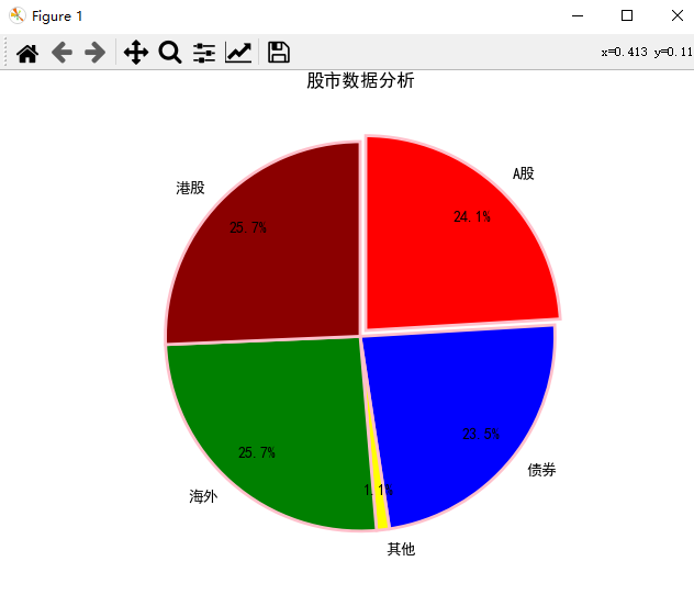
饼图
素材内容:
| 指数名称 | 市场 | 标的名称 | 持有市值 |
|---|---|---|---|
| 沪深300 | A股 | 510310 | 30000 |
| 沪深300 | A股 | 110020 | 20000 |
| 中证红利 | A股 | 515180 | 20000 |
| 中证消费 | A股 | 159928 | 20000 |
| 恒生指数 | 港股 | 513660 | 24000 |
| 标普500 | 海外 | 513500 | 24000 |
| 黄金ETF | 其他 | 518880 | 1000 |
| 主动债券 | 债券 | 110027 | 22000 |
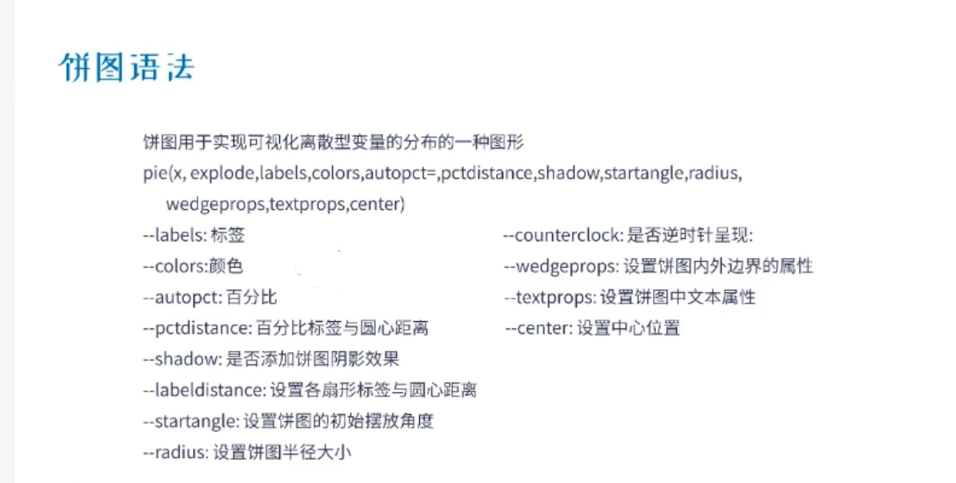
1 | plt.pie(x,explode,labels,colors,autopct,pctdistance,shadow,startangle,radius) |
以下是具体代码:
1 | # x 设置饼图数据 |
具体效果: